

This post contains affiliate links. We may earn a commission if you click on them and make a purchase. It’s at no extra cost to you and helps us run this site. Thanks for your support!
Seriously, I’ve seen brand guidelines templates that stop at the logo lockup and call it a day. But this coffee shop brand guidelines bundle from iStar Design doesn’t. I opened all 27 files in Illustrator and Photoshop over the course of a week, rebuilt a fictional cafe brand from the ground up, and pushed the color system further than any real client would ever ask me to. What came back convinced me this is one of the more complete brand identity templates I’ve tested this year, and I say that as someone who’s grown genuinely tired of “brand kit” bundles that only rebrand a logo three times and call it a manual.
The full bundle is available on Creative Market and YouWorkForThem. Individual parts of the bundle can be downloaded for free with an Adobe Stock subscription.
Please note that to customize these templates, you need Adobe Illustrator or Photoshop to be installed on your computer. You can get the latest versions from the Adobe Creative Cloud website. Just have a look here.
The full bundle is available on Creative Market and YouWorkForThem. Individual parts of the bundle can be downloaded for free with an Adobe Stock subscription.
What Exactly Is Inside This Coffee Shop Brand Guidelines Bundle?
The package ships as 27 presentation-style templates at 1920×1080 pixels, delivered in AI, EPS, PSD, and JPG formats. That’s a wide-format spread. Illustrator users get vector files they can rescale without losing edge quality. Photoshop users get layered PSDs for anyone who prefers raster workflows or wants to drop in real product photography fast. Free font links are included too, so you’re not left hunting for the typeface on some sketchy mirror site.
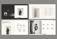
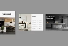
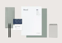
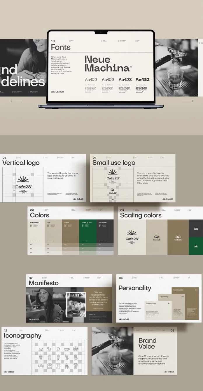
The manual itself walks through 25 distinct sections: Manifesto, Brand Voice, Personality, Vertical logo, Horizontal logo, Small use logo, Colors, Scaling colors, Fonts, Typography, Iconography, Business card, ID card, Menu, Loyalty card, Patterns, Shopping bag, Coffee label, Paper cup packaging, Paper cup holder, Food packaging, Signboard, App icons, Social Media, and Contact. That’s not a logo pack pretending to be a brand guidelines bundle. That’s an actual manual structure, the kind you’d hand to a print shop and a social media intern on the same afternoon.
The Full Manual Checklist, Slide by Slide
What struck me first is the sequencing. The bundle doesn’t jump straight to the logo. It opens with the Manifesto and Brand Voice, then Personality, before it even shows you the mark. That’s the correct order for a real identity document. Founders and marketing leads read the “why” before the visual system, and this template respects that reading path instead of front-loading the logo grid like a lot of cheaper templates do.
How the Cafe28 Demo Brand Holds Up Under Real Editing
iStar Design built the sample content around a fictional brand called Cafe28, a Brooklyn-style coffee and bakery concept. I used it as my test subject because a demo brand tells you more about a template’s flexibility than an empty placeholder ever could. Can you actually swap out “Cafe28” for something else without the whole layout falling apart? Here, yes. Text boxes hold their proportions when you lengthen a brand name. Layers stay grouped logically in the PSD files, so masking a new product photo into the paper cup mockup took about four minutes, not forty.
The Manifesto slide pairs a black-and-white lifestyle photo of a barista with a pull quote in a warm oak-toned panel. Swap the photo, swap the quote, and the composition holds. That’s a small thing, but it’s the difference between a template you can actually deploy and one you end up rebuilding from scratch anyway.
Introducing the Touchpoint Coverage Ratio
I want to propose a metric here, because “does it cover everything” is too vague to be useful when you’re comparing brand guideline bundles. Call it the Touchpoint Coverage Ratio: the number of real physical and digital brand applications a manual documents, divided by the number of applications a typical coffee shop or bakery actually needs to launch (signage, packaging, cups, menus, cards, social, app icons, and patterns). Most cheap logo-only kits score around 20 to 30 percent on this scale. This bundle covers signboards, paper cup packaging, cup holders, food packaging, shopping bags, coffee labels, business cards, ID cards, menus, loyalty cards, app icons, and social media guidance. Running the count puts it close to 90 percent coverage against a real launch checklist. That’s an unusually high number for a template you buy once and reuse.
The Manifesto-to-Execution Gap and Why This Bundle Closes It
Here’s a problem I run into constantly with brand strategy documents. Someone writes a beautiful manifesto about community and warmth, and then the actual printed materials look nothing like that language promised. I call this the Manifesto-to-Execution Gap: the distance between what a brand says it stands for and what its packaging, signage, and cups actually communicate on a shelf.
This bundle narrows that gap better than most. The Personality slide breaks Cafe28’s brand down into three stacked pillars: Community, Friendship, and Sustainable, each with a short explanatory paragraph. Then that language carries through. The Brand Voice slide describes the cafe as “warm, friendly, and always ready with a welcoming smile,” and the photography throughout backs that claim up with candid, unposed shots rather than stiff product photography. Words and visuals actually agree with each other here, which sounds obvious until you’ve reviewed enough templates where they don’t.
Typography and Color: Does the Palette Only Work for This One Coffee Shop?
The bundle’s demo system runs on Neue Machina, a geometric grotesque with a slightly industrial edge, paired with a five-color palette: white linen, oak, sand, forest green, and dark grey. Every color slide includes CMYK, RGB, and hex values, plus a scaling chart showing each color at 80, 50, and 30 percent tint. That’s genuinely useful for anyone who needs to build secondary palettes for seasonal menus or sub-brands without guessing at tints by eye.
The Neutral Palette Ceiling
Muted earth tones are everywhere in specialty coffee branding right now. Sand, oak, and forest green—you’ve seen this exact family of colors on a dozen third-wave coffee bags already. I’d call this the Neutral Palette Ceiling: the point at which a “warm and natural” color story stops differentiating a brand and starts blending it into every other cafe on the same street. This bundle sits right at that ceiling. The good news is the color system is fully editable, so a bakery leaning bright and playful, or a vegan cafe wanting more green saturation, can push past it without touching the layout structure underneath.
Iconography and Small Details That Actually Matter
The iconography slide deserves its own mention. It lays out a grid of custom line icons covering espresso cups, pour-over setups, French presses, kettles, and pastry items, arranged in a checkerboard pattern against alternating grey squares. Icons like this rarely get proper attention in brand templates, and having a consistent icon language ready for a menu board or an app interface saves real production time later.
Typography specimens go deep too. The Typography slide shows headline, subtitle, body text, and call-to-action hierarchy side by side, labeled H1 through H4, which is exactly the kind of reference a designer hands off to a client’s in-house marketing team so nobody improvises a random font size six months later.
Who This Coffee Shop Brand Guidelines Bundle Actually Fits
The listing states it suits cafes, bakeries, restaurants, coffee houses, vegan and healthy food concepts, catering businesses, and cooking schools. Having tested the layouts directly, I’d agree with that range, with one caveat. The earthy palette and editorial photography style lean naturally toward specialty coffee, third-wave roasters, and bakery-cafe hybrids. A fast-casual restaurant chain might need to push the color system harder to avoid looking like every other neighborhood coffee shop nearby.
| Detail | Specification |
|---|---|
| Bundle name | Brand Guidelines (Coffee Shop Edition) by iStar Design |
| Templates included | 27 presentation-style slides, 1920×1080 px |
| File formats | AI, EPS, PSD, JPG |
| Fonts | Free font links included, not bundled directly |
| Software needed | Adobe Illustrator or Adobe Photoshop |
| Manual sections | 25, from Manifesto to Contact |
| Best suited for | Cafes, bakeries, restaurants, coffee houses, vegan and healthy food brands, catering, cooking schools |
| Buy the full bundle | Creative Market, YouWorkForThem |
| Buy individual templates | Adobe Stock |
Where to Buy It, and Whether You Need the Whole Bundle
The complete brand guidelines bundle is available on Creative Market and YouWorkForThem. If you only need a handful of assets, say the packaging templates or the logo presentation slides, individual pieces are sold separately on Adobe Stock. That’s a genuinely practical option for freelancers working on a single deliverable who don’t want to pay for 27 templates when they need three.
Before You Start: What to Install First
Install every listed font before opening a single file. Then launch Illustrator or Photoshop and open whichever format matches your workflow: AI, EPS, or PSD. Skipping the font install step is the single most common reason a downloaded template looks broken on first open, and it has nothing to do with the quality of the files themselves.
My Honest Take After Testing It
I don’t hand out easy praise for template bundles, mostly because most of them recycle the same five layout ideas with a new color swap. This one earns its price by treating the manual as a working document instead of a mood board. The writing prompts embedded in each slide, the manifesto framing, and the personality pillars give a small studio or a solo cafe owner an actual structure to fill in, not just pretty boxes to stare at. My only real critique sits with that Neutral Palette Ceiling. Anyone using this for a brand that needs to stand out on a crowded coffee row should plan to push the color system harder than the demo does.
The full bundle is available on Creative Market and YouWorkForThem. Individual parts of the bundle can be downloaded for free with an Adobe Stock subscription.
Frequently Asked Questions
What software do I need to edit this coffee shop brand guidelines bundle?
You need Adobe Illustrator for the AI and EPS files or Adobe Photoshop for the PSD files. Both apps let you fully edit text, colors, backgrounds, and photos.
Can I use this brand guidelines bundle for a bakery or restaurant instead of a coffee shop?
Yes. The listing specifically covers cafes, bakeries, restaurants, coffee houses, vegan and healthy food concepts, catering companies, and cooking schools, and the layout structure works across all of them.
Do I need to buy the entire bundle, or can I get individual templates?
You can buy the full 27-template bundle on Creative Market or YouWorkForThem. Individual templates are also sold separately on Adobe Stock.
Are the fonts included in the download?
The fonts aren’t bundled as files directly. The product includes links to download the required fonts for free before you start editing.
How many templates come in the full brand guidelines bundle?
The bundle includes 27 presentation templates at 1920×1080 pixels, covering everything from logo variations to packaging and social media guidelines.
Is this brand guidelines bundle good for beginners?
The layered PSD and vector AI files make it approachable for beginners, though basic familiarity with Illustrator or Photoshop layers will make editing faster.
Don’t hesitate to find other professional graphic design and branding templates here at WE AND THE COLOR.
Subscribe to our newsletter!